
Overview & Creative Direction
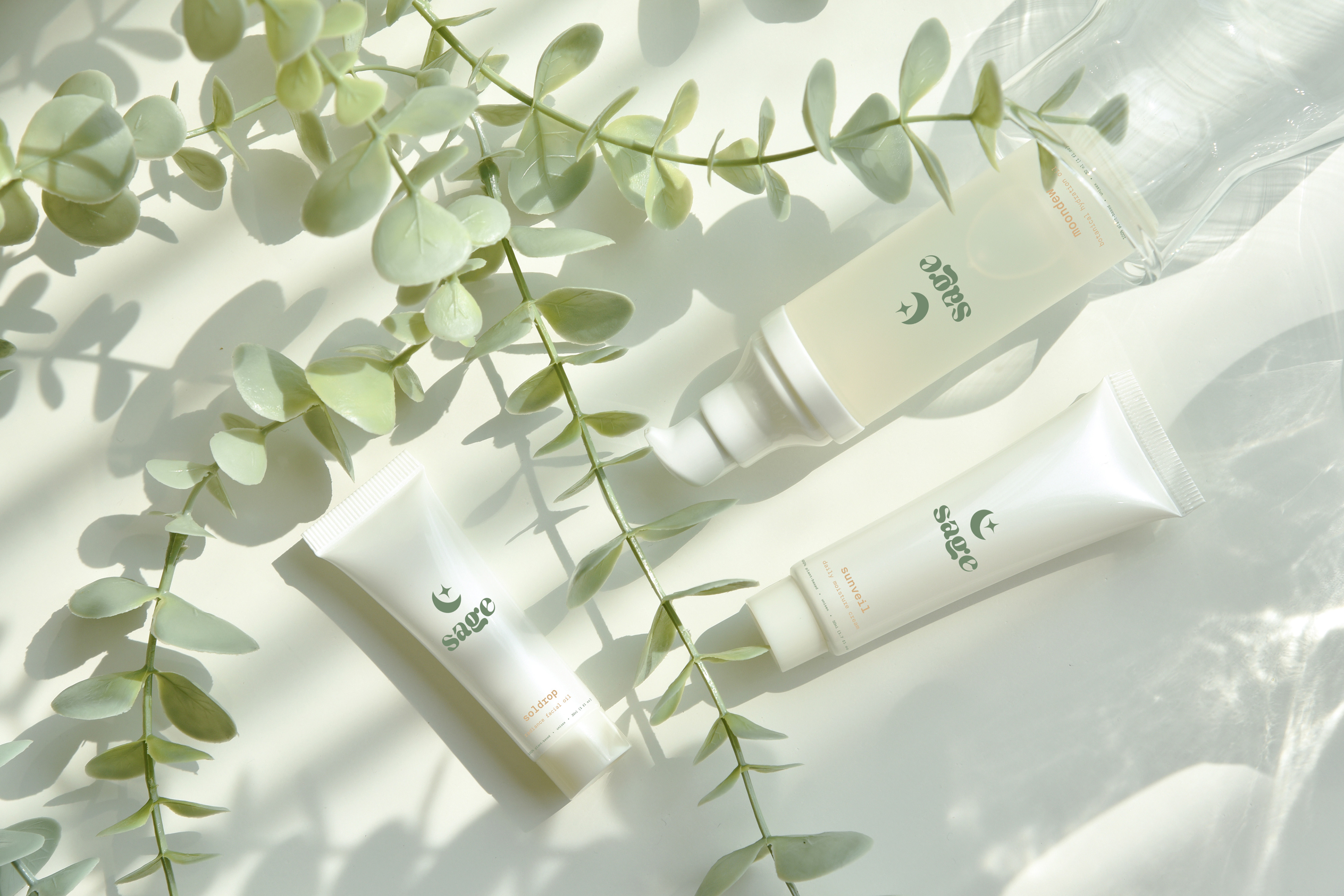
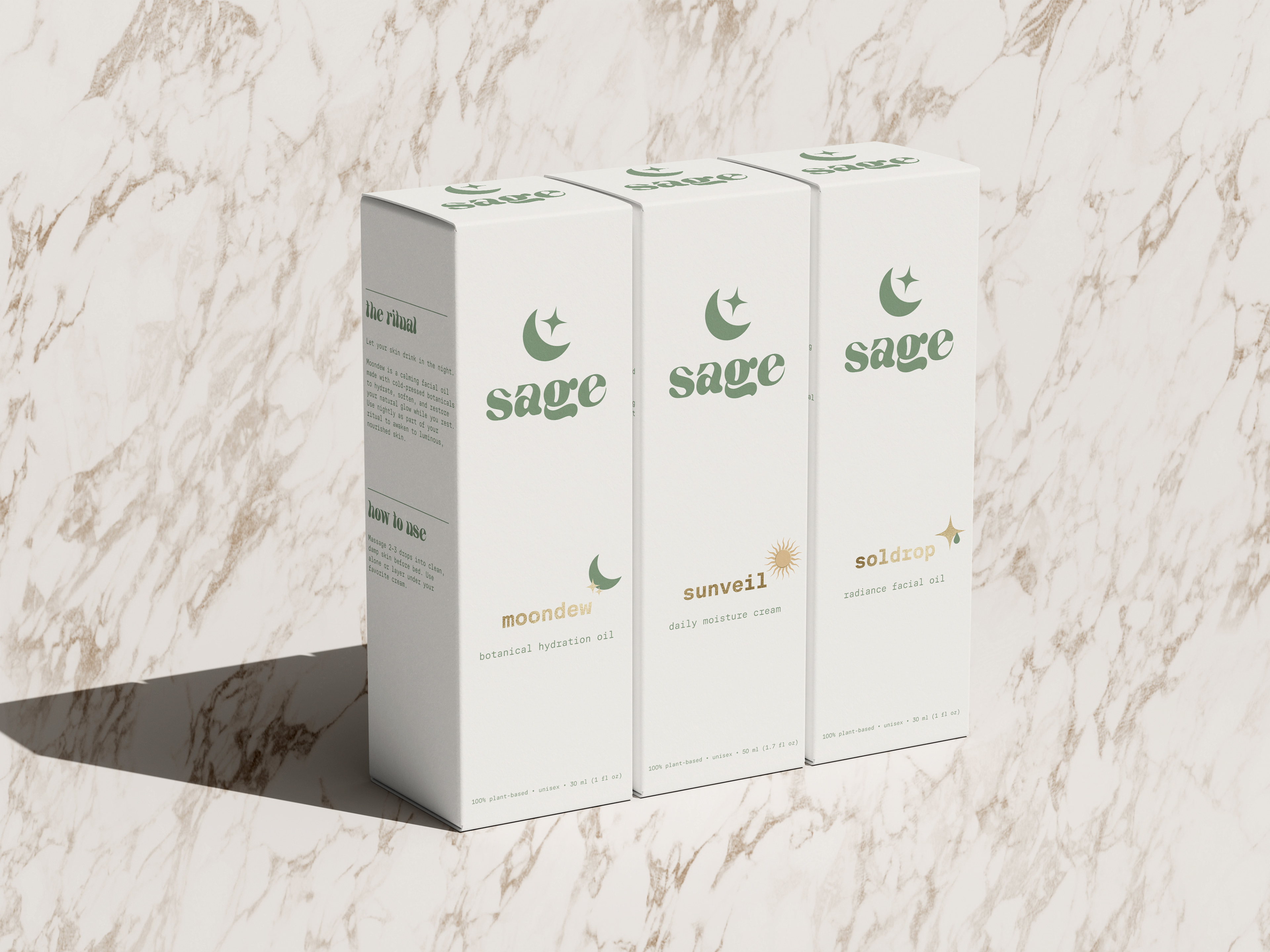
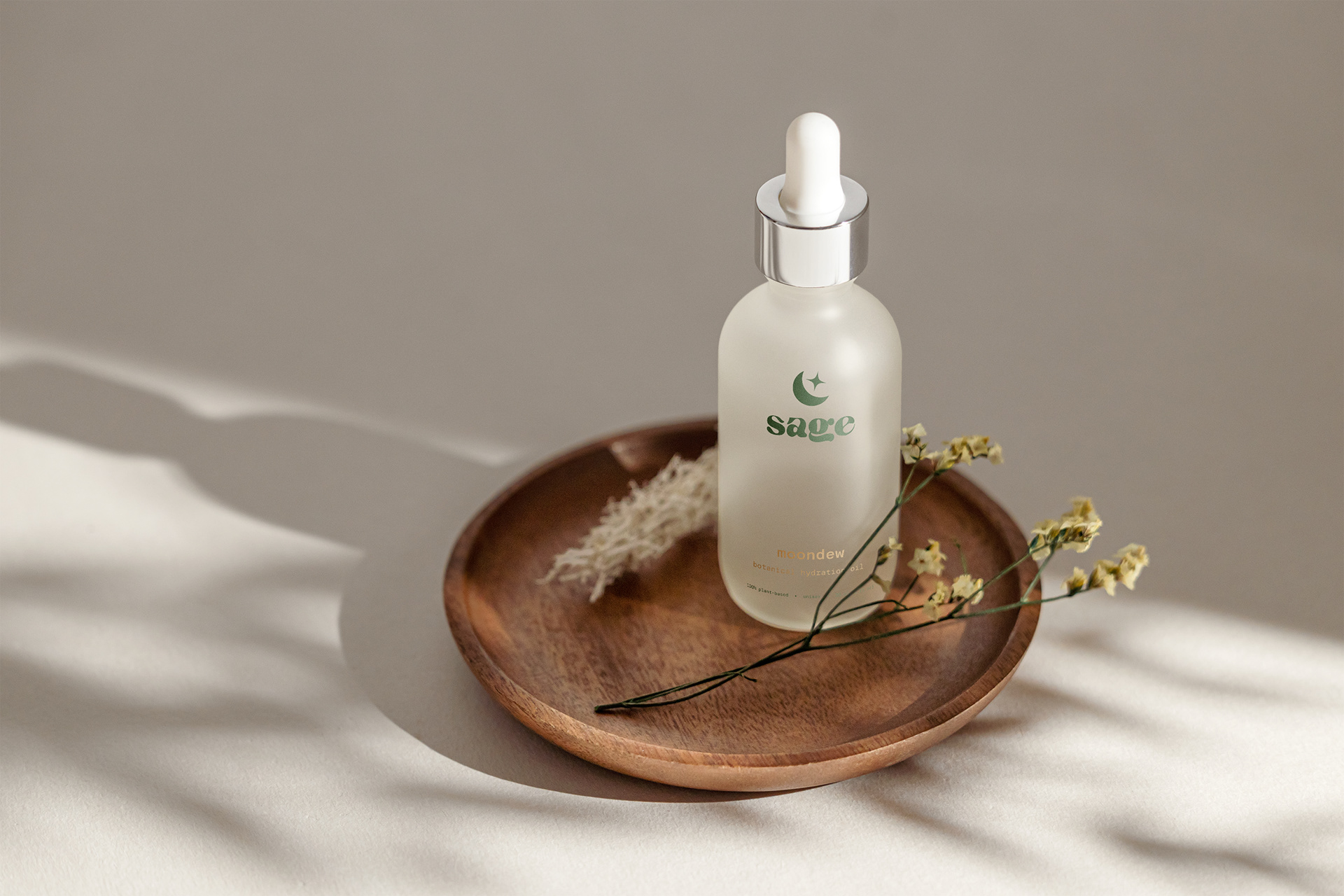
Sage Skincare is a clean beauty brand built around calm, ritual, and natural healing. The project focused on translating those values into a minimal, grounded brand identity and packaging system that would feel serene and intentional at every touchpoint.
Inspired by botanical wellness and earth-conscious living, the brand’s color palette sets a soft, grounded tone while typography plays a key role in the brand’s personality. The overall identity is clean but never sterile, designed to invite users into a moment of quiet ritual.
Deliverables
- Brand identity
- Packaging
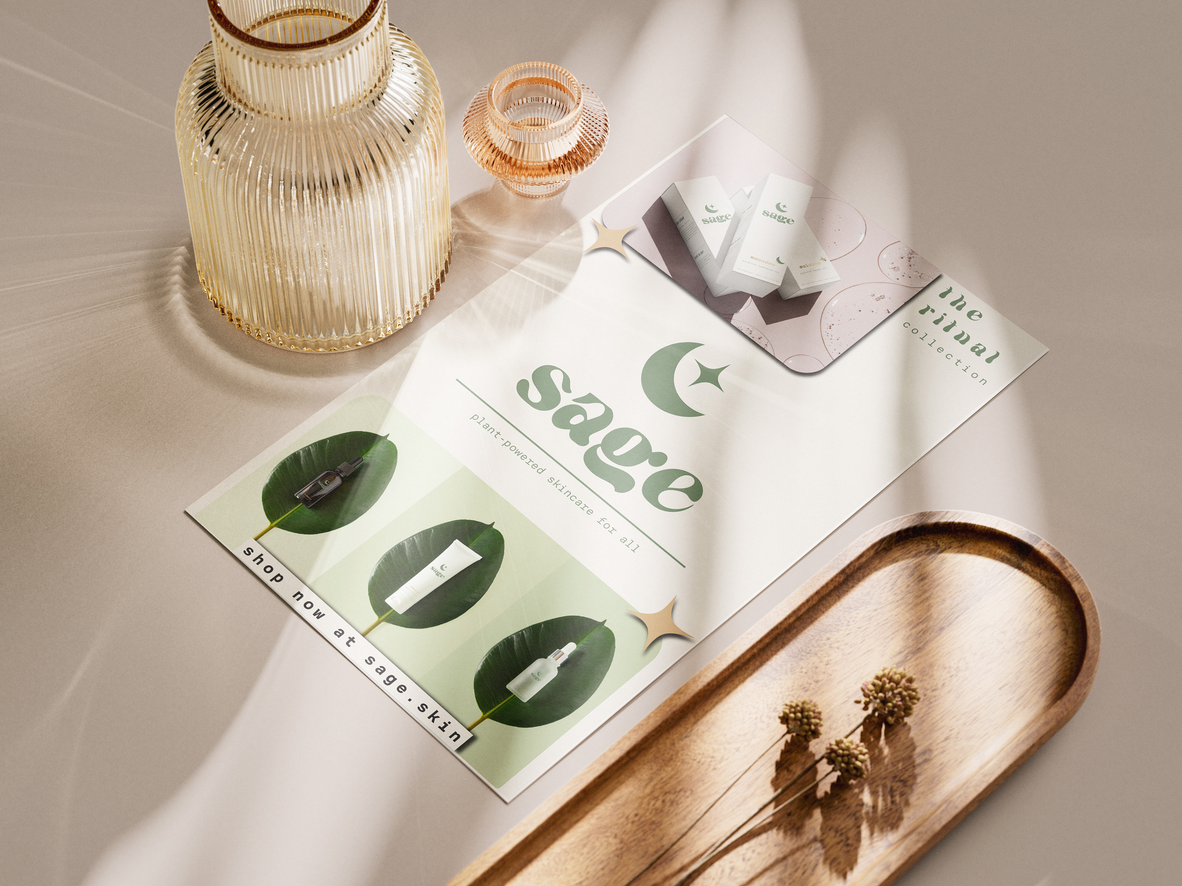
- Social media feed
- Print flyer
Tools Used: Illustrator, Photoshop, InDesign